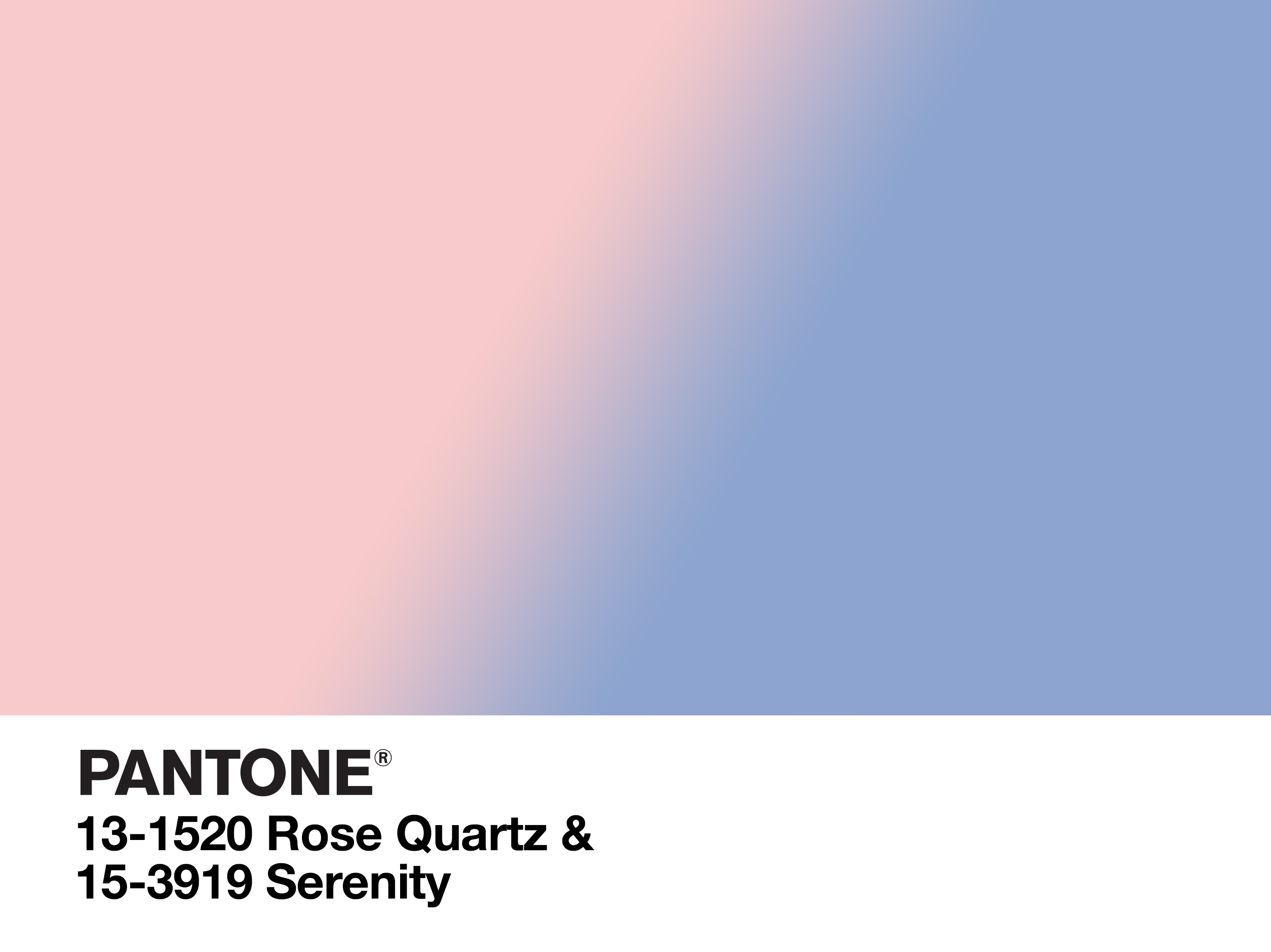
Do you follow the Pantone Colors of the Year? This year, Pantone’s anointed colors are Rose Quartz and Serenity, two pastels selected to inspire calm and acceptance.
As I rifle through my bag of nail polish and land on Zoya’s pastel blue shade, “Blu,” I consider how I always think of DIY manicures as self-therapy. Of course, caring for your nails (whether or not you actually paint them) is indeed a form of self-care—just like exercising or relaxing by your favorite candle. But there’s something special about applying color to the nails. Each week, a different color speaks to me—and is often just what I need—sheer pink, when I want to feel comforted, feminine, and polished; unapologetic red when I need a little umph in my step and whip in my hair; or perhaps pale blue, when I’d desire peace and calm of the non-stuffy variety.
Oddly, it’s only now occurred to me that fashion and beauty can serve as a sort of color therapy. I’m certainly not alone in the thought, however.
This year, color authority Pantone Color Institute released two colors of the year for 2016: Serenity (a pale blue edging on periwinkle) and Rose Quartz (a soft, neutral-toned pink). The idea behind the selection stems from consumers’ increasing desire for wellness and tranquility in a hectic and often troubling world:
“Joined together, Rose Quartz and Serenity demonstrate an inherent balance between a warmer embracing rose tone and the cooler tranquil blue, reflecting connection and wellness as well as a soothing sense of order and peace.”
—Leatrice Eiseman, Executive Director of Pantone
The two soft colors also represent and encourage a progressive stance on gender identity and self-acceptance. As the Pantone site explains, the world is witnessing a welcome gender blur in fashion:
“This more unilateral approach to color is coinciding with societal movements toward gender equality and fluidity, the consumer’s increased comfort with using color as a form of expression, a generation that has less concern about being typecast or judged and an open exchange of digital information that has opened our eyes to different approaches to color usage.”
So, progressive ideas of identity + cool people + social media = More freedom of expression via color. I like it!
Indeed, Rose Quartz and Serenity were chosen to inspire a sense of peace and acceptance not only with the surrounding world but also with ourselves and motivate us to express our identity in whatever way (and color) we choose—even if that expression contradicts outdated, gendered dualities. Pink no longer equals “girl,” and blue no longer equals “boy.” (But my sheer pink polish can still be “feminine,” right?)
Interestingly, Pantone’s conception of light blue and pink align with notions of traditional color therapy. Color therapy, or chromotherapy, holds that each color possesses unique healing properties. According to color therapy, pink is associated with the warm, comforting environment of the womb while blue is tied to the sixth chakra, Anja: the throat, or the third-eye, the locus of insight, wisdom, and dreams.
Even if you’re a not too sure about this therapy business, you can still embrace soothing pastels for spring à la vegan.
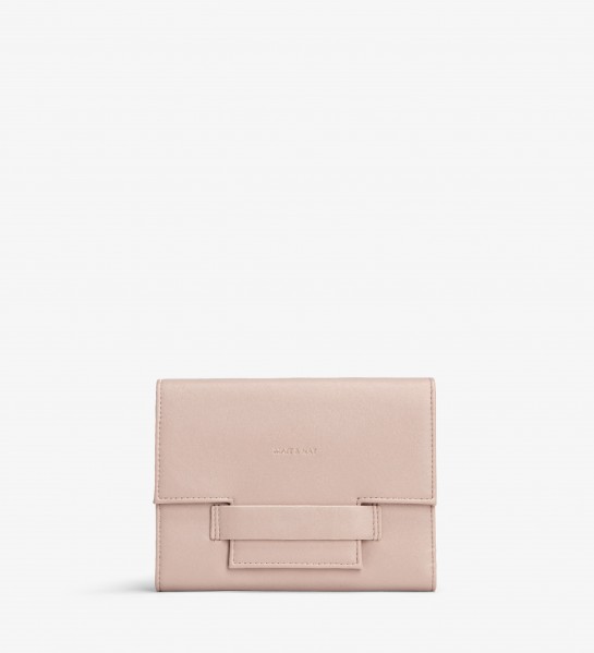
For a sweetly hued pink bag, go for Matt & Nat Cynnie in “Petal.”
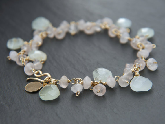
Combine both Rose Quartz and Serenity in a pink a blue bracelet, like this rose quartz (literally) and aquamarine boho bracelet by Yoga Chick Jewelry.
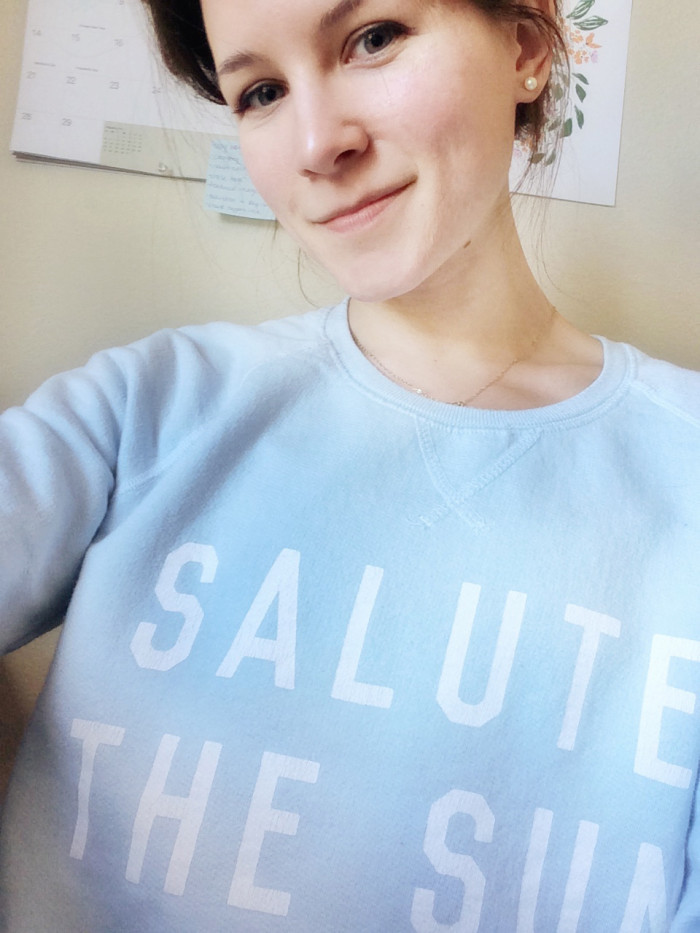
Saluting the sun (whilst sitting at my desk) in pale blue.
How will you wear Pantone’s Colors of the Year for 2016?
And are you totally obsessed with baby pink and blue like me?
Related: Yoga for Sacral Plexus Chakra
How to Unlock the Sixth Chakra and Rediscover Your Intuition
Love this article? Keep up-to-date on the latest from Peaceful Dumpling: Subscribe to our Newsletter!
Photos: Pantone Color Institute, Matt & Nat, Yoga Chick Jewelry